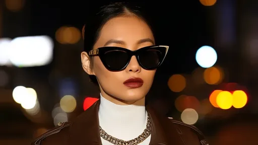
The world of makeup artistry thrives on one fundamental principle that separates amateurs from professionals – the mastery of color balance. While trends come and go with seasonal collections, the timeless science of chromatic harmony remains the backbone of every flawless makeup application. This delicate equilibrium goes far beyond simply matching eyeshadow to lipstick; it involves a sophisticated understanding of undertones, contrast ratios, and the optical illusions created by strategic pigment placement.
Understanding the color wheel's role in makeup forms the foundation of all professional cosmetic applications. Makeup artists don't simply see colors as standalone hues but rather as relational elements that either complement or clash with a client's natural features. The circular spectrum becomes a strategic map where warm tones (reds, oranges, yellows) interact with their cool counterparts (blues, greens, purples) to create visual harmony. What makes this particularly fascinating is how these principles adapt differently across various skin tones, requiring artists to mentally adjust the wheel's proportions for each unique canvas.
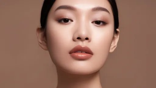
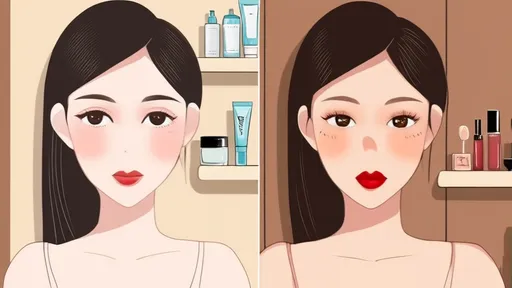
The human face naturally possesses its own color story that makeup either enhances or disrupts. Skin undertones – those subtle hints of pink, yellow, olive or peach beneath the surface – act as the silent conductors of this chromatic orchestra. Professional artists spend years training their eyes to detect these nuances, as misreading undertones leads to the most common makeup mistakes. A foundation with the wrong undertone doesn't simply look "off," it creates a disharmony that makes all subsequent colors appear disconnected from the wearer's natural coloring.
Seasonal color analysis, though often dismissed as an 80s trend, has resurged in professional makeup circles with more sophisticated interpretations. The modern approach no longer boxes individuals into rigid spring, summer, autumn or winter categories but instead uses the seasonal framework as a starting point for understanding how colors interact with personal pigmentation. A "winter" complexion might share certain characteristics, but the specific balance of cool to warm, clear to muted varies infinitely. This explains why two people with similar skin tones can look drastically different wearing the same bold red lipstick.
The concept of "color weight" represents one of makeup artistry's more advanced balancing techniques. Just as interior designers consider visual weight when arranging furniture, makeup artists assess how different pigment densities affect facial equilibrium. A deep burgundy lip carries substantial chromatic weight that demands either equally intense eye makeup or deliberate restraint elsewhere. This explains why many classic makeup looks follow the "feature emphasis" rule – dramatic eyes paired with neutral lips or vice versa – as maintaining equal intensity across all features often creates visual overload.
Modern makeup trends increasingly play with asymmetrical color balance, particularly in editorial and avant-garde applications. Rather than distributing color evenly across the face, artists create intentional imbalance that somehow achieves harmony through contrast. A neon orange graphic liner on one eye might balance against a muted peach blush swept dramatically up to the temple on the opposite side. These looks succeed because they consider the face as a three-dimensional landscape where colors interact spatially, not just side-by-side.
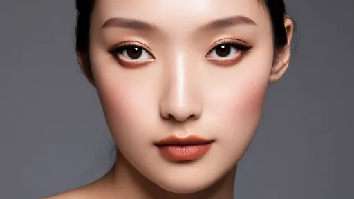
The psychology of color perception further complicates these artistic decisions. Simultaneous contrast – the phenomenon where colors appear different based on adjacent hues – means that a blush shade changes character depending on whether it's paired with warm or cool foundation. Professional makeup kits contain multiple versions of what clients might consider "basic nude" because these neutrals transform based on surrounding colors. A beige that disappears on one skin tone might pull unexpectedly yellow or pink on another due to these optical interactions.
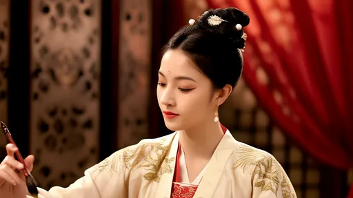
Cultural color associations add another layer to the balancing equation. In Western bridal makeup, white-based color schemes symbolize purity, while traditional Chinese brides often incorporate red for luck and prosperity. Globalized beauty trends now require artists to understand how colors communicate across cultures, especially when creating looks for international clients or multicultural events. A color-balanced face for a Tokyo street style enthusiast follows different rules than a Milan fashion week attendee, even if both technically adhere to color theory principles.
The rise of augmented reality makeup try-ons has unexpectedly advanced public understanding of color balance. As consumers experiment virtually with extreme colors they'd never attempt in real life, they intuitively learn how adjusting one element necessitates changes elsewhere. Someone might start with electric blue eyeliner, then naturally gravitate toward softening their blush and lip color to compensate. This digital playground provides real-time education in color equilibrium that previously required professional training to comprehend.
Skin prep and texture now factor into color balance discussions more than ever. The "glass skin" trend demonstrated how surface finish alters color perception – dewy complexions make colors appear more blended and harmonious, while matte finishes increase contrast and separation. Contemporary artists often adjust color intensity based on a client's skin texture, knowing that the same pigment appears bolder on smooth young skin versus more mature textures where it might settle into lines. This represents color balance in the fourth dimension – how hues evolve throughout the day as makeup interacts with shifting skin conditions.
Environmental considerations have begun influencing color balance choices as well. LED lighting in offices casts different tones than natural sunlight, meaning daytime makeup must account for these chromatic shifts. Smartphone cameras and their automatic color correction present another variable – colors carefully balanced for real life might translate poorly on screen unless the artist understands how different devices process hues. Some luxury makeup brands now formulate products specifically designed to maintain color integrity under various lighting conditions and digital capture.
The future of color balance in makeup points toward hyper-personalized chromatic profiles. Advanced skin scanning technology can now map an individual's unique color absorption and reflection patterns, allowing for truly customized palettes. Rather than choosing from predetermined warm or cool categories, clients receive makeup designed for their exact pigment interaction signature. This technology, currently limited to high-end studios, may eventually democratize to consumer devices, fundamentally changing how we approach color selection.
Ultimately, mastering color balance in makeup transcends following trends or rules. It requires developing an artist's eye for seeing colors in relationship rather than isolation, understanding that every hue exists in context. The most breathtaking makeup looks achieve that magical equilibrium where colors don't merely coexist but elevate each other and the wearer's natural beauty. As the industry evolves with new technologies and global influences, this core principle remains unchanged – true artistry lies in the balance.
By /Jun 28, 2025
By /Jun 28, 2025
By /Jun 28, 2025
By /Jun 28, 2025
By /Jun 28, 2025
By /Jun 28, 2025
By /Jun 28, 2025
By /Jun 28, 2025
By /Jun 28, 2025
By /Jun 28, 2025

By /Jun 28, 2025
By /Jun 28, 2025
By /Jun 28, 2025
By /Jun 28, 2025
By /Jun 28, 2025
By /Jun 28, 2025
By /Jun 28, 2025